Looking for a new hue to express what it feels like to get hitched in 2022? Check out Pantone’s Color of the Year 2022, Very Peri. For the first time in its history, Pantone created a color for its Color of the Year. Very Peri may be the perfect hue for you.
“As society continues to recognize color as a critical form of communication, and a way to express and affect ideas and emotions and engage and connect, the complexity of this new red violet infused blue hue highlights the expansive possibilities that lay before us,” says Laurie Pressman, Vice President of the Pantone Color Institute.
Very Peri is a great color for weddings as it works well with many colors and elements according to Leatrice Eiseman, Executive Director of the Pantone Color Institute.“It’s a great color to use for a wedding because it is very versatile and combines well with many other colors. Not only in the garments and hair ornaments of the wedding party, but especially for the guys’ cummerbunds, socks, and ties, also on the tabletop for the reception. If the bridesmaids get very experimental, peri is a great hair tipping color (for ushers as well). Floral décor would also be gorgeous and unexpected against white table linens,” says Eiseman.
Something Borrowed Blooms create lovely centerpieces.
Create beautiful centerpieces and bouquets
Very Peri is the perfect color to pop in your posies. See it bloom in the Millie Collection from Something Borrowed Blooms, a collection of English garden-inspired silk florals featuring butterfly hydrangeas, lilac, English roses, and delphinium. This timeless and romantic collection is perfect for a backyard wedding or a ballroom affair.
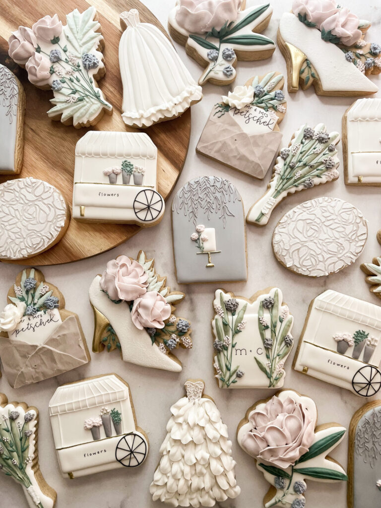
A delicious and delicate color for confections
As a cookie artist, Renee Terry of Sweet Cheeks by Renee loves seeing what the Pantone color of the year selection is going to be so she can prepare for her wedding orders in the coming year. “I love to pair and complement colors and tones together in my cookie sets, so I am excited to see what blends I will get to achieve using this Very Peri color! It is such a delicate color that I believe will pair well with not only other delicate and muted colors, but a nice deep tone to really set it all off!” says Terry who is the recent winner of the Food Network’s Christmas Cookie Challenge.
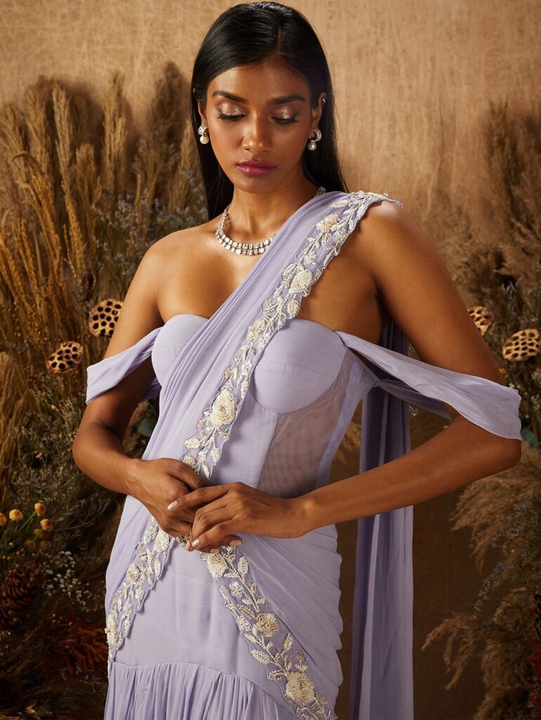
A stunning shade for a sari
KYNAH’s Ariese is a Very Peri corset draped sari paired with an attached pre-draped, pre-stitched, hand embellished pallu.
Isabelle Selby Photography. Courtesy of Bespoke Only
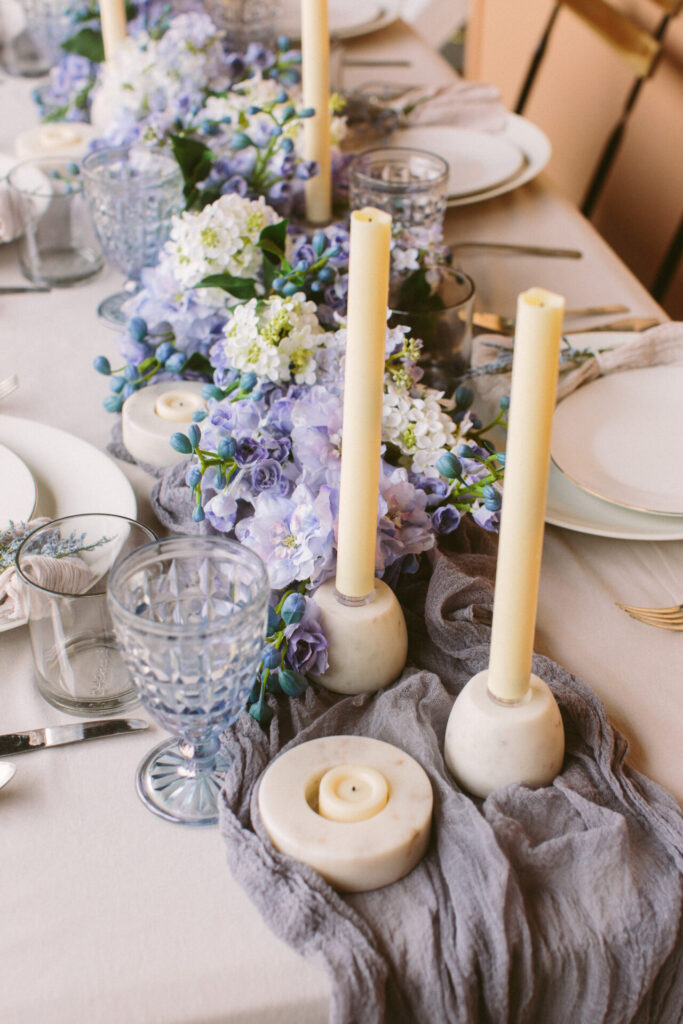
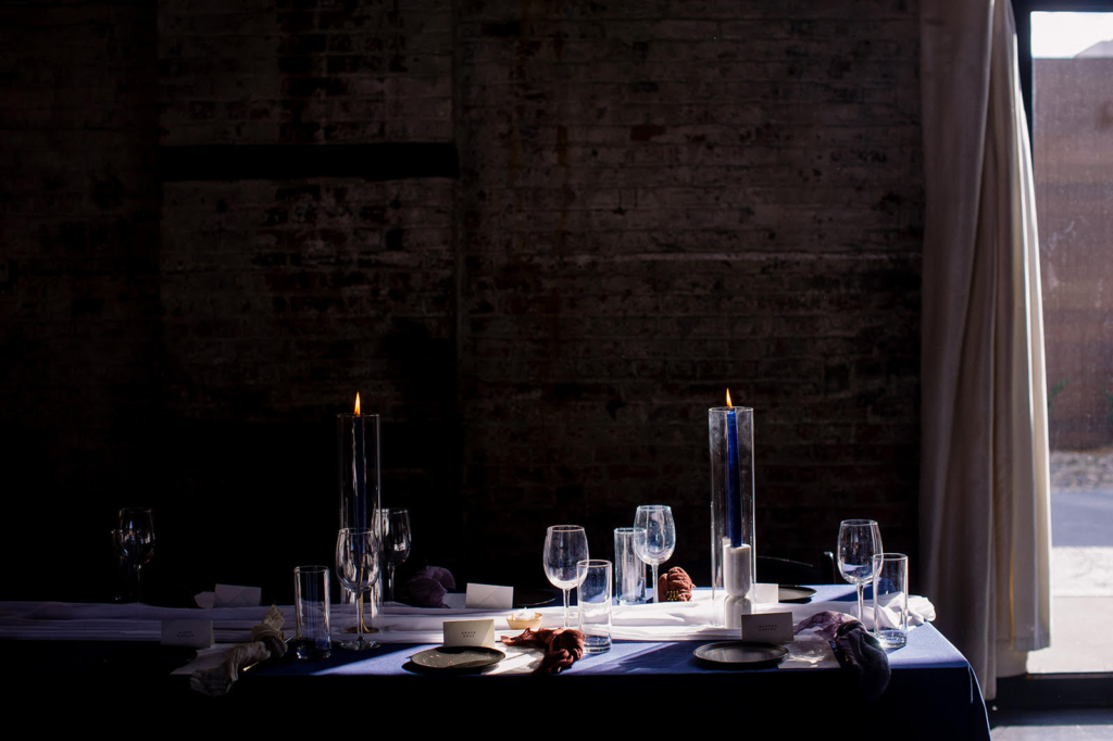
A fanciful element for tablescapes
“Very Peri is such a unique hue, and we find that just a touch adds a fanciful element to a tablescape or floral arrangement. From there, we like to play with the deeper tones found within the color to create drama and depth. It’s all about finding the appropriate placement and balance,” says Melissa Lee, founder and creative director of New York-based design firm, Bespoke Only.
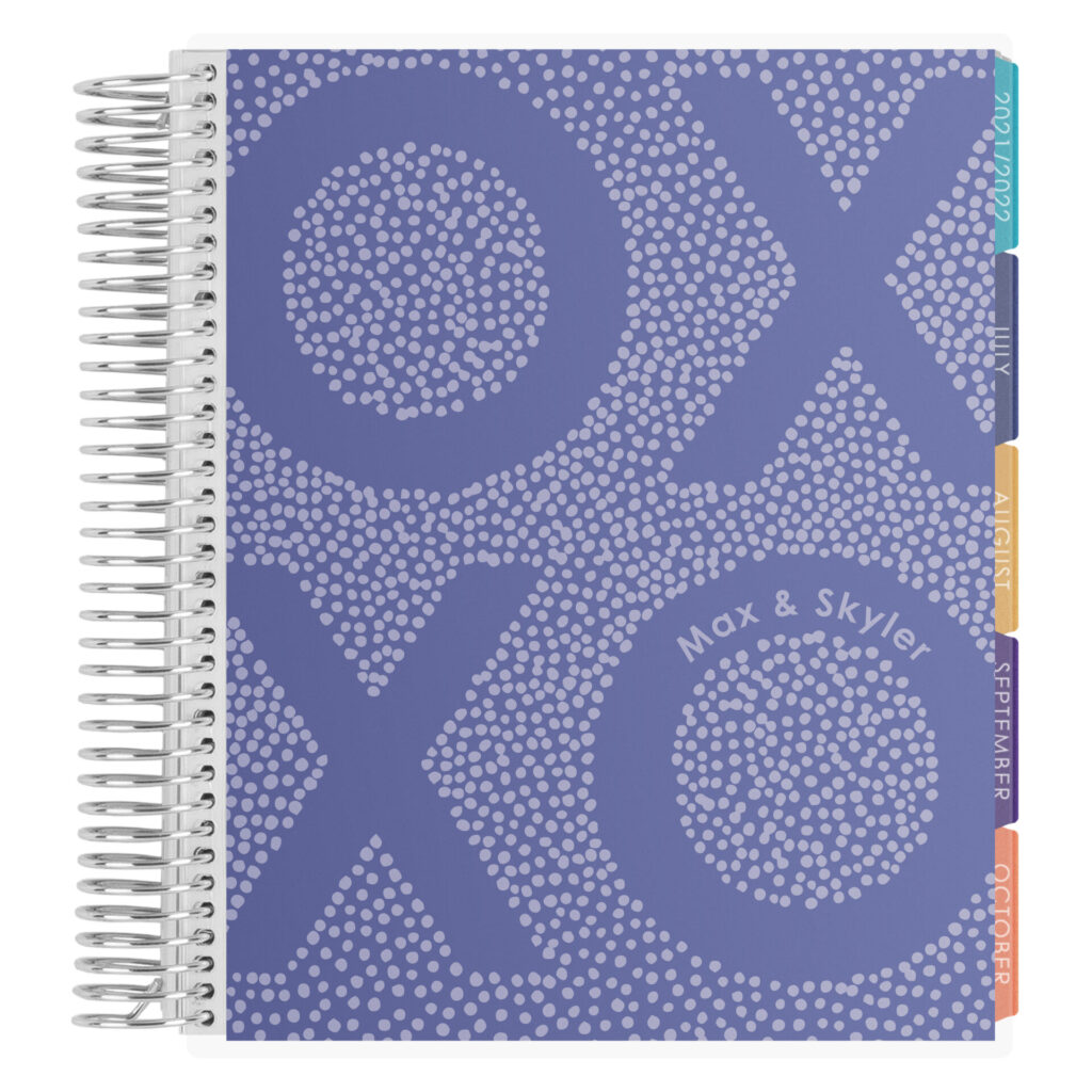
A creative color to inspire your wedding plans
Erin Condren’s Wedding Planner is available in this creative color. The undated 12 or 24-month planner includes handy checklists, charts, scheduling spreads, trackers, new customizable monthly tabs and more. The planner is a great way to keep track of your wedding dreams!
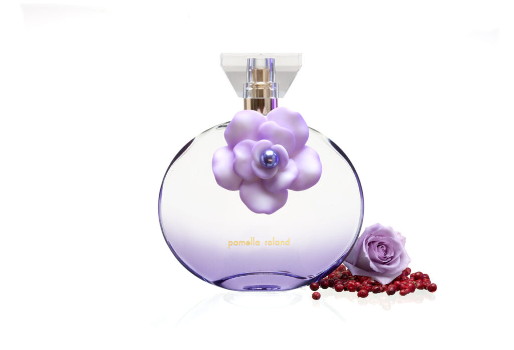
A ‘scentimental’ shade
Pamella Roland celebrates love with a trio of products: a fragrance candle to set the mood, rich body cream to indulge your skin, and a timeless and modern fragrance to perfume the air with a lovely scent to remind you of the moment. All three shimmer in Very Peri.
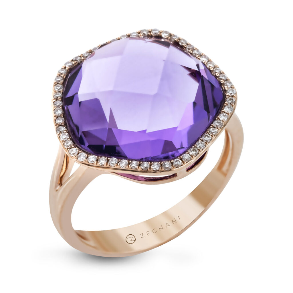
A dazzling ring tone
The beautiful tones of Very Peri are shown in this Amethyst ring by Zeghani. Ancient Greeks wore amethyst and carved drinking vessels from it in the belief that it would prevent intoxication. Amethyst, a semiprecious stone, is often used in jewelry and is the traditional birthstone for February.
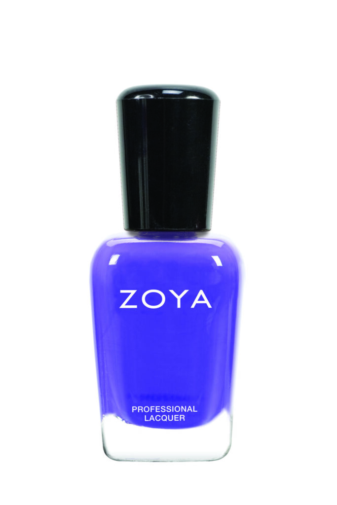
A beautiful nail polish shade
Zoya nailed it with this beautiful shade called Serenity. The polish can be best described as a summer purple in a full coverage and densely pigmented cream formula. The shade is reminiscent of beautiful blooming irises, a harbinger of summer.
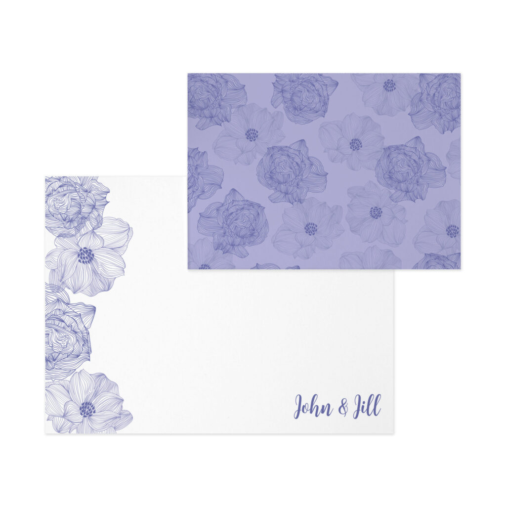
A creative colorway
Wouldn’t you love to get a note written paper in this gorgeous color? Hand-drawn florals bloom forth from Erin Condren‘s modern and geometric design featuring linear outlines of large blossoms. You can choose two complementary colors and customize to suit your style!
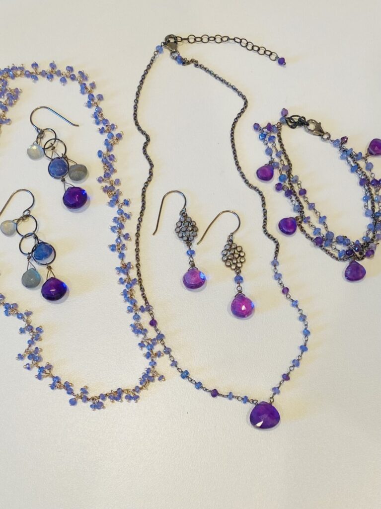
Bedazzling as bespoke jewelry
Very Peri is a beautiful color for a coastal or winter wedding. “Whether a bride selects to incorporate the hue to creatively celebrating something blue in a pair of earrings or necklace or give her bridesmaids beautiful Tanzanite bracelets, Very Peri is lovely. Creating a bespoke piece of jewelry in Pantone’s Color of the Year 2022 will serve as a timeless treasure for a wedding,” says Pam Older of Pam Older Designs.